Mexico and the World
Vol. 12, No 4 (Fall 2007)
http://profmex.org/mexicoandtheworld/volume12/4fall07/rev elomeli.html
VISUALIZING WHERE HAVE MEXICAN MIGRANTS TO THE USA HAVE LOCATED THEMSELVES SINCE 1965
Using Geographical Information Systems (GIS) Analysis
to Show Change By Decade
By J. Eric Lomelí
Migrant studies encompass a vast sphere of themes due to the fact that any study implicates dozens of academic disciplines. Emphasis in migrant studies may be historical, economic, social, political, cultural or in countless disciplines and inter-disciplines.
In order to profoundly understand any of these studies, it is not only required to define the emphasis but to know where are the groups in question have geographically located themselves at different points in time. Knowing the where allows for insightful analysis that shows the mobility of migrant groups. Here I focus on Foreign-born and specifically Mexican migrants.
Geographical Information Systems (GIS), a set of computing tools that allow for spatial analysis and relationships, have become increasingly sophisticate to open analysis of an infinite number of new geo-analytic possibilities.
My purpose in showing here the use of GIS analysis is two-fold:
First, I use U.S. Census data to show by decade how the Foreign-Born population (i.e. migrants) expanded their number of locations in different regions of the USA by decade.
Second, I organize the U.S. Census data to reveal “community service geographies” available to the specific location of Mexican migrant groups in the United States by revealing political and economic geographies that permit us to achieve new types of analysis, specifically for the example of San Antonio, Texas, (i.e. West Side) which provides a high-density case study.
For the latter purpose, “community service geographies” include school districts, political districts (congressional, senate, etc.), census (by numerous population areas), and many more. The power of information is obtained by making the relationship between these geographies and demographic data at various levels: national, regional, state, and local.
FIRST PURPOSE—ANALYZING THE NATIONAL LEVEL
Although migrant groups of any place, origin or historical frame now can be identified geographically in order to obtain the best analytical result of a study. I show by decade in the following maps how the focus of the Mexican migrant population in the United States has expanded to ever more regions.
Map 1 presents a visual representation of the migrant (i.e. foreign-born wave up to the 1960s (e.g. prior to 1965) into the United States.
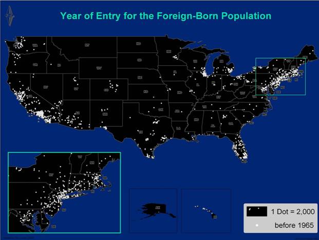
Map 1
This map shows migrant concentrations in different parts of the country. And although it is for the total foreign-born population, it is historically known that the clusters in the West and Southwest are predominantly Mexican migrants.
Map 2 shows the years 1965 to 1979 (green dots).
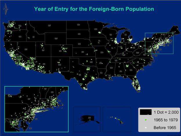
Map 2
By 1979, it is clear that the wave of migration continues to expand from the original migrant clusters of 1965. We begin to recognize, more clearly, migrant regions in states such as California, Washington, Nevada, Arizona, Colorado, Utah and Texas. This migrant-sprawl picture will not be as clustered by 1989.
Map 3 shows the years 1980 to 1989 (red dots).
By 1989, small concentrations of migrants begin to emerge in different regions of the South and Midwest, while the older ‘classical’ migrant clusters expand in foreign-born population, while more recent migrant-centers are much more defined in states like Georgia, the Carolinas and Minnesota.
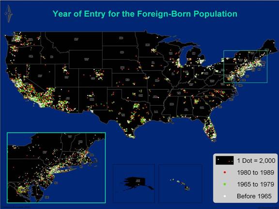
Map 3
Map 4 shows the years 1990 to 2000.
By the year 2000, whole national regions present contiguous clusters of foreign-born population. Urban centers in New York, Great Lakes, Florida, Texas and the Midwest reflect a strong presence of a ‘new’ migrant population that was not there in the 1990 census.
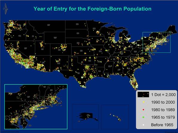
Map 4
It is inevitable to notice the metropolitan concentrations in Seattle (WA), Portland (OR), Reno and Las Vegas (NV), Salt Lake City (UT), Boise (ID), Denver (CO), Albuquerque (NM), Wichita (KS), Kansas City (MO), Omaha (NE), Minneapolis/St. Paul (MN), Birmingham (AL), Nashville (TN) and many, many more.
However, how can one be certain that the foreign-born population is from a specific country? For example, how do we know that the new concentrations in North Carolina or Atlanta are from Mexican foreign-born population? Fortunately, the U.S. Census also provides us with an enlighten variable: ‘Place of Birth for the Foreign Population by Country’.
Map 5 shows the concentration of Mexican foreign-born population in the United States in the year 2000.
This picture alone is worth a thousand words. It presents a crystal-clear picture of not only the Mexican-migrant clusters but also of their mobility through the decades. ‘Classic’ Mexican-migrant concentrations are easily recognized: California, Arizona, Nevada, Texas, Colorado, Utah, Illinois and even New York (where there is a strong migrant population from the state of Puebla). Furthermore, and for numerous future studies, we can see new concentrations of Mexican-migrants in non-traditional areas such as Washington D.C., Detroit (MI), South Bend and Indianapolis (IN), the whole state of North Carolina, Tulsa (OK), Fayetteville (AR) and even rural Iowa.
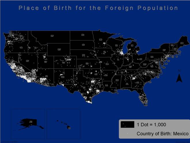
Map 5
What new areas will emerge as hubs of migrant populations when the 2010 results are revealed? Even in the present (i.e. 2007) surely there are hundreds of new white points in areas that the 2000 data draws black. Who will step forward to aid and assist these new groups with the adequate community services needed for their human development?
SECOND PURPOSE—SHOWING POSSIBILITIES FOR ANALYZING A LOCAL LEVEL SUCH AS SAN ANTONIO’S WEST SIDE.
Here I use detailed U.S. Census data to analyze and show demographic characteristics of groupings by census tracts (between 3 and 5 thousand habitants on average) or by census block group (with an average between 1 and 3 thousand). It is important to note that there is one smaller census geography, a census block, but the detail of the data are less available due to the right of privacy of individuals.
In seeking to determine the type of existing migration by examining a census block group, it is possible to obtain the following type of information: total population, number of non-Hispanics, gender, various income methods (median, family, household), poverty level, average family size, education level, employment status, or even their region of birth (e.g. in the state of residency, other U.S. regions, foreign country, citizen or naturalized citizen and the time of period of entry). The list of available information is practically infinite, but it is the combination/relationships of the last mentioned (i.e. citizenship status and time period of entry into the country) that allows us to identify if a community is composed of new or old migration.
Considering census block group (48-029-151400-1) as a random example (located in heart of the Southside in San Antonio, Texas):
Population: 1,317
Non-Hispanic: 150
49% Male, 51% Female
Median Family Income: $29,800
Per Capita Income: $9,118Percentage with High School Diploma (25+): 27%
Source: Bureau of the Census, 2000
From the census data shown above, it is possible to observe that it contains a predominant number of Hispanics with strong economic deficiencies in terms of income and education. With GIS it is possible to create a map of this geography, and its adjacent areas, with different points of reference to basic community services to any population and that are necessary to its development, such as: libraries, public high schools, fire stations, police stations, parks and recreational areas, hospitals, medical clinics or even voting poll locations. All of these places may be represented with points in a map and contain individual information and data.
Map 6 shows such community service location described above within a radius of 1 mile of the sample area (i.e. a census block group in Southside of San Antonio). However, the cruel reality is that with the exception of two high-schools, a 9-acre park and a small clinic, no other community services are available to this population of close to twenty thousand within this area.
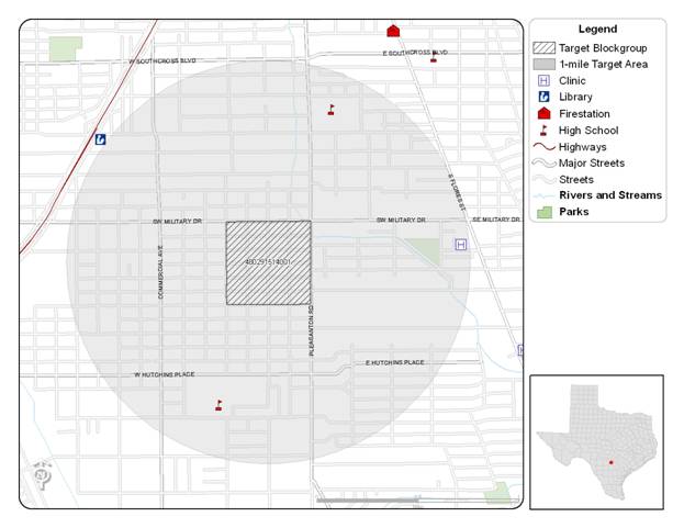
Map 6
It is also possible to visually identify infrastructural needs in a community by examining a satellite image (as seen in Map 7).
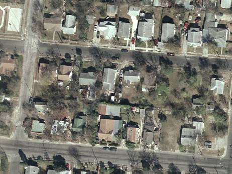
Map 7
Perhaps the ‘needs’ are not evident right away. However, presenting a comparison to other locations in the city (i.e. Northside) may accent the infrastructure differences (see Map 8).

Map 8
CONCLUSIONS
In the first purpose presented, readers can see that the GIS approach reveals that the extent of change in the distribution of the Mexican migrant population in the USA has had strong repercussions by the middle of the first decade of the twenty-first century.
Secondly, the case of San Antonio reveals how the problem of matching community service geographies with the Mexican migrant population in a major center of Mexican migrant residence in the USA is evident even by comparing aerial imagery. The U.S. Census variables of income and education further mark these vast differences.
What happens after locating a migrant population group and identifying the need or inexistence of some (or all) basic community services? There are various entities that could successfully mobilize the community, the private sector, and the different level of government, or preferably all of them, to respond effectively in the edification of the community’s needs. Among these entities we find academic organization of higher learning, non-for-profit organizations, and other non-governmental institutions with the powers of networking, analysis, and capital. |